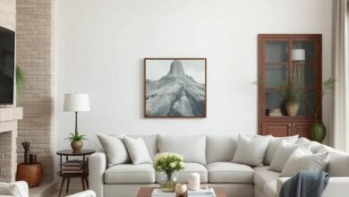
Elevate Your Space: Inspiring Living Room Color Combos with Timeless Neutral Tones
In the heart of every home, the living room serves as a canvas where life unfolds—where stories are shared, laughter echoes, and comfort reigns. As a gathering place for family and friends, this space deserves an ambience that not only inspires but also reflects yoru unique style. Enter the realm of color—where the subtle art of combining hues can transform a mundane setting into a sanctuary of sophistication. In this article, we invite you to elevate your space with inspiring living room color combinations that harmonize beautifully with timeless neutral tones. From soft beiges to warm greys, we’ll explore how these understated shades can serve as the perfect backdrop for creativity, inviting a sense of tranquility and elegance to your home. Whether you’re considering a fresh look or a complete makeover, let the interplay of color and neutrality guide you in crafting the living room of your dreams.
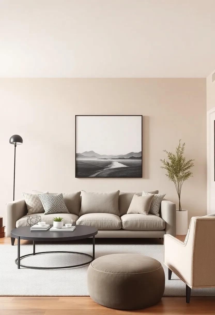
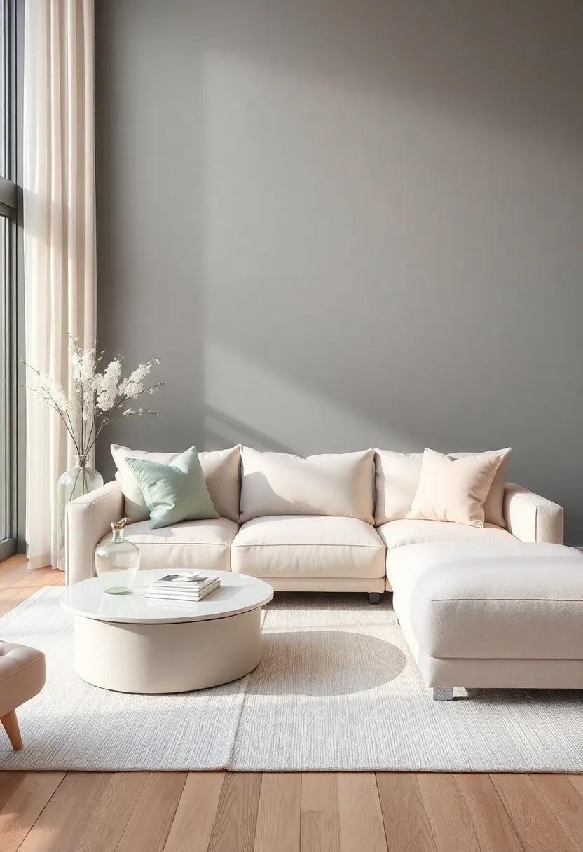
A Welcoming Embrace of Warm Taupe and Soft Cream in Your Living Room
The harmonious combination of warm taupe and soft cream creates a serene ambiance that invites relaxation. By dressing your living room in these gentle hues, you can achieve a look that is both sophisticated and cozy.Taupe, with its earthy undertones, pairs exquisitely with cream to add depth and texture, elevating your space to a luxurious retreat. To enhance this palette, consider incorporating various materials such as plush textiles and natural wood accents that echo the warmth of these colors.This interplay between tones and textures paves the way for a welcoming atmosphere that your family and guests will appreciate.
A few thoughtful elements can elevate the aesthetic further:
- Layered Textiles: Utilize soft throws, plush cushions, and silk drapes to introduce softness and comfort.
- Artful Decor: Add wall art that reflects the palette, perhaps with abstract cream and taupe designs that complement your furnishings.
- Natural Touches: Incorporate plants through simple ceramic pots in light colors, tying the color scheme into the vibrant greens of nature.
The warm tones can also serve as a perfect backdrop for accents—think of rich wooden furniture or metallic details like brass or gold, which can add a touch of glamour to the otherwise muted setting. In this way, your living room becomes not just a space to inhabit, but an expression of style and comfort.
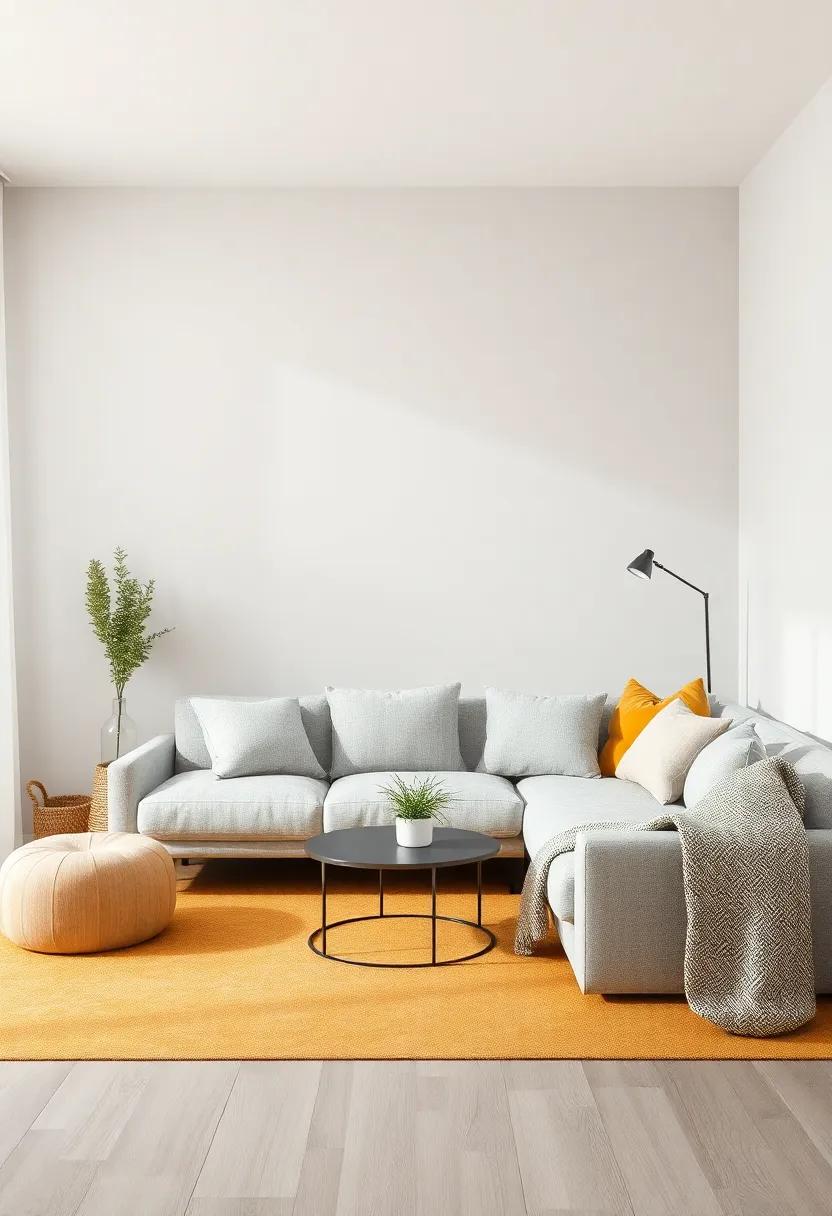
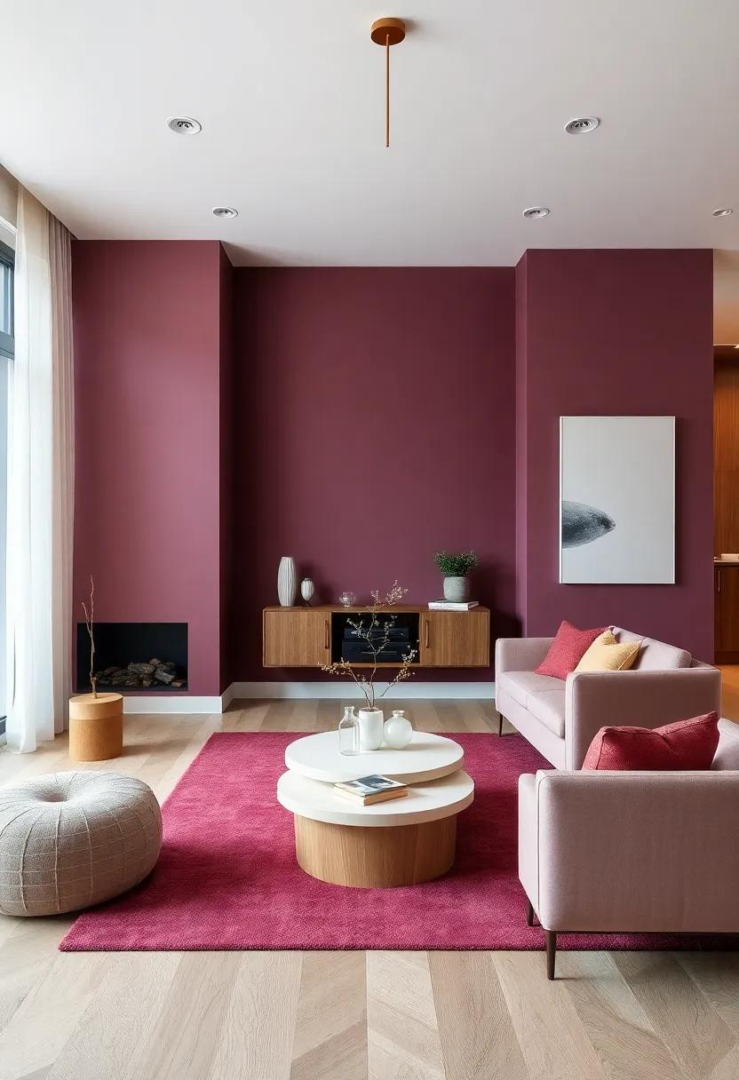
The Serenity of Cool Grays Paired with Accents of Blush Pink
The calm of cool grays creates a serene foundation for any living room, offering a canvas that is both modern and inviting. When paired with accents of blush pink, the atmosphere transforms into a harmonious blend of sophistication and warmth. This dual palette invites tranquility into your space, making it an ideal setting for relaxation or lively conversations. To enhance this aesthetic, consider incorporating elements such as:
- Textiles: soft throws and plush cushions in blush pink contrast beautifully against gray sofas.
- Artwork: Abstract pieces that merge gray tones with splashes of pink can serve as stunning focal points.
- Accessories: choose vases or candles in complementary shades to unify the overall design.
A thoughtfully arranged layout utilizing these colors not only elevates the design but also fosters a sense of comfort. In spaces where light plays a crucial role, the cool gray paints can soften harsh light, while blush accents introduce a gentle warmth that makes the surroundings feel more inviting. Consider the following combinations to ensure a balanced approach:
| Element | Color | Suggested Use |
|---|---|---|
| sofa | Cool Gray | Main seating area |
| Cushions | Blush Pink | Layering for comfort |
| Rug | Gray with Pink Accents | Ground the space |
| Wall Art | Mixed Tones | Visual interest |
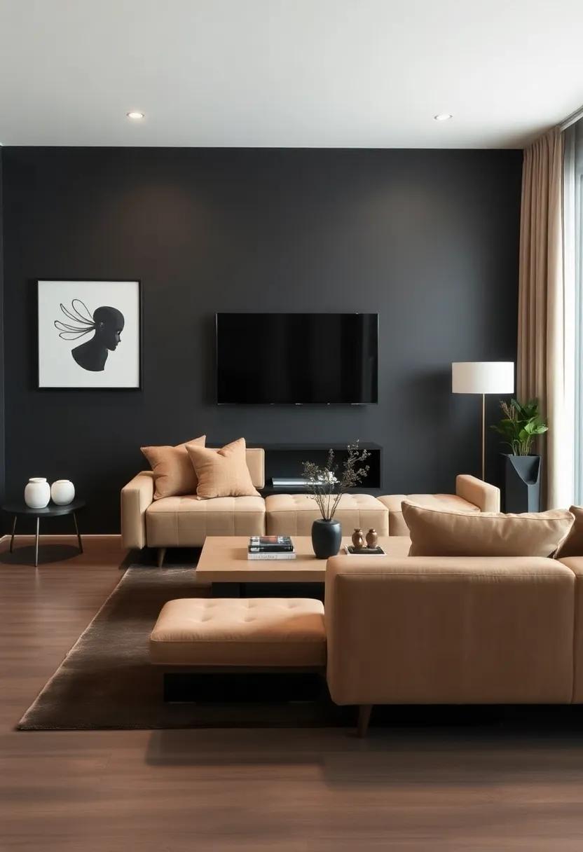
Exploring the Depths of Charcoal and Almond for a Sophisticated Look
Incorporating shades of charcoal and almond into your living room can create a sophisticated ambiance that is both modern and timeless. The deep richness of charcoal serves as a grounding element, perfect for creating contrast against lighter elements.This captivating hue can be used on an accent wall,as upholstery,or through decorative accessories. Pair it with almond for a harmonious balance; the warm, creamy tones of almond lighten the overall effect and invite a sense of calmness. Together, these colors form a refined palette that enhances the elegance of your space.
To achieve a cohesive look, consider employing a few strategic design techniques:
- Textured Fabrics: Introduce plush cushions or throws in charcoal or almond to add depth.
- Statement Furniture: Opt for a charcoal sofa paired with almond-colored armchairs for contrast.
- Layered Lighting: Use soft lighting to highlight the richness of both colors, creating a warm atmosphere.
Here’s a simple table illustrating some complementary accents that work beautifully with these tones:
| Accent Colors | Suggested Use |
|---|---|
| Soft Taupe | Area Rugs |
| Muted Gold | Light Fixtures |
| Deep Forest Green | Plant Pots |
Natural Textures: Combining Rustic beige with Smooth Stone hue
Embrace the beauty of nature in your living space by melding the organic warmth of rustic beige with the sophisticated allure of smooth stone hues. This captivating color combination creates a harmonious balance, drawing inspiration from earthy textures that invite relaxation and comfort. Imagine soft beige walls that embody the essence of natural fibers, paired with sleek stone accents on furniture or decorative elements. This juxtaposition not only enhances visual appeal but also encapsulates a serene atmosphere, making it perfect for unwinding after a long day.
To bring this color scheme to life, consider incorporating various textures that complement both hues. A curated selection might include:
- Woven Fabrics: Cushions and throws in natural fibers add depth.
- Raw Wood: Furniture pieces in a light finish provide rustic charm.
- Polished Stone: Decorative vases or tabletops introduce a sleek element.
For a more elevated aesthetic, use decorative features such as:
| Element | Texture Type |
|---|---|
| Area Rugs | Natural Fiber (e.g., jute, sisal) |
| Wall Décor | Stone-inspired Art |
| accent Pillows | Soft Velvet in beige |
This combination not only sets a stylish tone but also establishes a space that feels both grounded and inviting, perfectly showcasing the beauty of neutral tones.
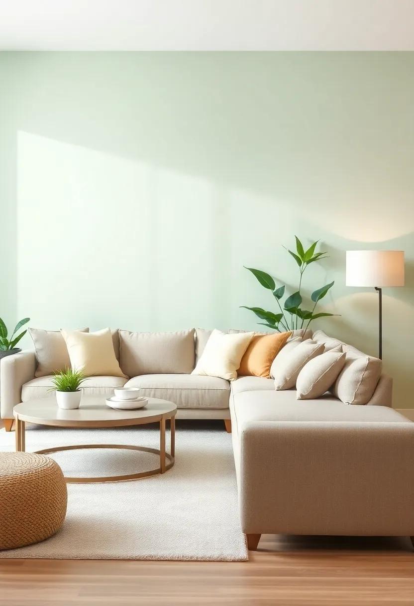
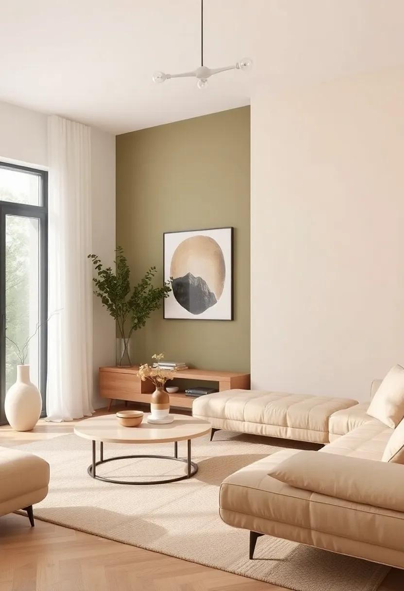
Elevating Elegance with Subtle Sage and Crisp White Accents
Transforming your living space into a serene sanctuary begins with the right color palette. The combination of gentle sage green paired with crisp white accents creates a soothing visual experience, perfect for contemporary and customary aesthetics alike. This palette not only infuses a sense of calm but also fosters an inviting atmosphere. Consider employing sage on your walls or larger pieces of furniture, while utilizing white for trim, textiles, or decor items, which will brighten the space and create the illusion of openness.
To further enhance this elegant theme, incorporate understated elements and nature-inspired accessories.Choose furnishings that feature natural materials and soft textures, such as linen and wood. Add layers with items like:
- Sage throw pillows to introduce depth and comfort
- White ceramic vases that accentuate the fresh feel
- Botanical prints or artwork that reflect the green tones of the palette
This thoughtful approach to design not only highlights the beauty of simplicity but also celebrates the elegance of harmonizing contrasting tones.
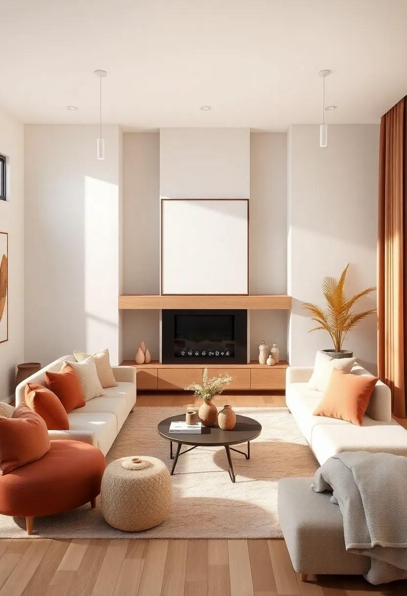
Creating Balance with Muted Earth Tones and Pops of Terracotta
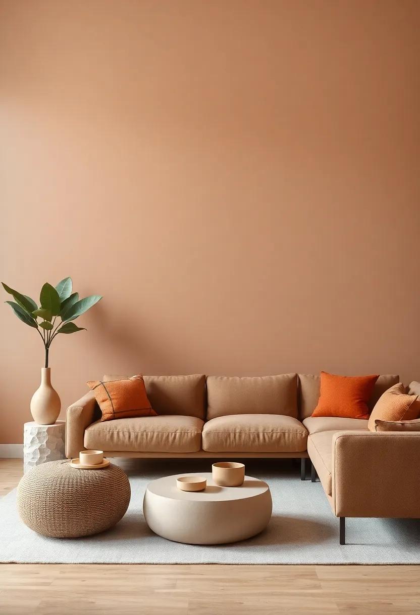
When it comes to designing a harmonious living room,the interplay of muted earth tones and striking terracotta can create an inviting atmosphere.These soft, natural hues serve as a serene backdrop while adding warmth and depth to your space. Consider integrating shades like soft beiges, warm taupes, and gentle olives to form a cohesive foundation for your decor. By layering these neutrals, you not only cultivate a calming environment but also allow for the vibrant terracotta accents to truly stand out.
To effectively incorporate pops of terracotta, think about strategically placing them in smaller, impactful ways. You might choose to highlight these accents through:
- Throw pillows in rich terracotta hues
- Art pieces that feature natural elements
- Decorative vases or pottery
- Accent furniture,such as a statement chair or side table
This approach ensures the terracotta elements draw the eye without overwhelming the palette,thereby fostering balance and tranquility within your living area.
Transitional Spaces: Blending Warm Ivory and Dusty Blue for Cohesion
Creating a harmonious blend in your living space often calls for a refined color palette. The combination of warm ivory and dusty blue possesses a unique ability to evoke feelings of tranquility while infusing the area with a modern touch. Warm ivory serves as a soft, inviting backdrop that enhances natural light, making a room feel airy and spacious. Simultaneously occurring, dusty blue introduces just the right amount of contrast, adding depth without overwhelming the senses. Together, these colors work as a perfect pair, providing a cohesive visual flow that seamlessly transitions throughout the space.
To enhance this color scheme, consider incorporating various textures that echo the warm tones of ivory and cool undertones of blue. Think about adding elements such as:
- Soft linen throw pillows in dusty blue for comfort and style.
- Woven baskets in natural fibers to reinforce the warm ivory base.
- Art prints that feature blended hues to tie the color scheme together.
In furniture, balance is vital; opt for pieces that showcase both colors. A cozy ivory sofa paired with dusty blue accent chairs creates a visually appealing focal point, while a coffee table with subtle wood tones brings warmth into the scene. By layering these elements thoughtfully, your living room will not only reflect a cherished aesthetic but will also foster a sense of comfort and unity.
The Allure of Deep Navy with Light Buff for a Statement Space
The combination of deep navy and light buff creates a striking contrast that can transform any living room into a sophisticated haven. Deep navy, often associated with calmness and reliability, serves as an anchor for the space, inviting tranquility while instilling a sense of depth. On the other hand, the soft warmth of light buff introduces an element of lightness and airiness, balancing the darker tones beautifully. By using these two colors in tandem, you can achieve a harmonious atmosphere that feels both inviting and chic.
To maximize the impact of this color pairing, consider the following design elements:
- Statement Furniture: opt for navy sofas or chairs to act as focal points, complemented by buff-toned cushions.
- Accent Walls: Paint one wall in deep navy to create a dramatic backdrop, enhancing the room’s visual interest.
- Art and Decor: incorporate artwork with hints of both colors to tie the room together seamlessly.
- Textiles: Use light buff curtains or rugs to soften the overall look and provide contrast without overwhelming the space.
| Color | Emotion |
| Deep Navy | Calmness |
| Light Buff | Warmth |
This blend of hues not only creates a cozy atmosphere but also enhances natural light, making the space feel larger and more open. The versatility of this palette allows for endless creativity, enabling you to reflect your personal style through various décor choices. Whether you prefer a modern, minimalist look or a more traditional approach, the deep navy and light buff combination stands out as a timeless masterpiece in home design.
Timeless Elegance: Blending Rich Chocolate Brown and Soft Ivory
The combination of rich chocolate brown and soft ivory creates a backdrop that embodies sophistication and warmth. These colors work harmoniously to create an inviting atmosphere, perfect for a living room. By pairing deep brown furnishings with ivory accents, you can build a space that feels both grounded and elegant. Consider a plush chocolate sofa as the centerpiece, complemented by ivory throw pillows or a textured ivory rug that adds a layer of softness. This contrast not only enhances visual appeal but also invites relaxation.
To further enhance this palette, incorporate natural elements that resonate with this timeless theme.A few ideas include:
- Wooden accents: Utilize walnut or mahogany coffee tables to add depth.
- Artwork: Choose frames in a dark finish to contrast with lighter art pieces.
- Textiles: Layer fabrics with varying textures to create visual interest.
| Decor Element | Color Choice |
| Wall Color | Soft Ivory |
| Sofa | Rich Chocolate brown |
| Accents | Textured Ivory |
Inviting Harmony Through Light Taupe and Deep Forest Green pairings
When harmonizing your living space, consider the enchanting blend of light taupe and deep forest green. This duo invites a sense of tranquility and connection to nature,making it an ideal choice for fostering a calming atmosphere. Light taupe, with its soft, neutral undertones, serves as a versatile backdrop that brightens your room while allowing deep forest green to provide a rich contrast that’s both grounding and invigorating. The effect is a balanced aesthetic that can easily transition from cozy gatherings to quiet evenings at home.
To enhance this pairing, incorporate elements that resonate with both colors. Utilize furniture pieces and accessories that celebrate the palette’s elegance,including:
- Textured cushions in deep green to add depth and comfort.
- Wooden accents that echo the organic vibe of forest hues.
- Artworks highlighted with shades of taupe and green to tie the room together.
Consider layering your textiles with distinct patterns while keeping the overall color scheme unified. A simple selection of rugs, curtains, and throws can amplify the warmth of taupe while showcasing the lushness of green, ultimately creating an inviting space that feels both fresh and timeless.
Modern Minimalism: the Calm of Pale Gray with Soft Mustard Highlights
In the realm of modern design, the pairing of pale gray with soft mustard highlights creates a soothing ambiance that balances tranquility with a touch of warmth. This color combination epitomizes minimalism, allowing the subtle nuances of your living space to shine through without overwhelming the senses. Incorporating the cool tones of gray provides a serene backdrop, while soft mustard accents add a refreshing burst of color, creating visual interest that feels intentional yet effortless.When curating your living room, consider these essential elements:
- Textured Fabrics: Use soft textiles in gray and layer with mustard throw pillows or a cozy blanket.
- Artwork & Decor: Choose pieces that blend these colors seamlessly, such as framed prints featuring abstract designs.
- Accent Furniture: Invest in a mustard-hued chair or ottoman to create a focal point in the room.
More than just a color scheme, this palette fosters an inviting atmosphere, perfect for gatherings or quiet evenings at home. When arranging your space, light gray walls can be complemented by strategically placed mustard decor items, promoting a sense of flow throughout the room. Consider adding a simple coffee table set up, as detailed in the table below, to enhance function while embodying your aesthetic:
| Item | color | Style |
|---|---|---|
| Throw Blanket | Pale Gray | Textured Knit |
| Cushions | Soft Mustard | Geometric Pattern |
| Coffee Table | Natural Wood | Scandinavian |
Chic Contrast: Charcoal Black and Warm Sand for a Bold Statement
Transform your living room into a striking haven with the dynamic pairing of charcoal black and warm sand. this bold color scheme creates an elegant contrast that captures attention while providing a cozy atmosphere. charcoal black serves as a grounding hue, offering depth and sophistication to any space. In contrast, warm sand infuses a sense of comfort and lightness, drawing on nature’s palette to soften the starkness of black while adding warmth to your environment.
To enhance this combo, consider incorporating various textures and materials to harmonize the colors. items such as plush cushions, woven throws, and sleek furniture can complement these hues beautifully. A well-placed table can serve as a centerpiece for this sophisticated palette. here are a few suggestions to elevate the design:
| Element | Suggested Style |
|---|---|
| Rug | Textured, light neutral |
| Artwork | Abstract in warm shades |
| Cushions | Mix of patterns & solids |
| Lighting | Metallic accents for contrast |
By carefully selecting furniture and decor items that play off these colors, you can achieve a living room that feels both luxurious and inviting. Embrace the interplay of light and dark, creating an ambiance that is perfect for both relaxation and entertaining.
the Refreshing Tones of Seafoam Green and Natural Bamboo Beige
Imagine walking into a serene living room, where the soothing hues of seafoam green harmoniously blend with the warm undertones of natural bamboo beige. This combination evokes feelings of tranquility and warmth, creating an inviting atmosphere perfect for relaxation. The cooler, coastal vibes of seafoam green offer a refreshing escape reminiscent of ocean breezes, while bamboo beige grounds the space, adding a touch of earthy elegance.Together, these colors create a canvas where your furnishings and décor can shine.
To fully embrace the beauty of this color duo in your living space, consider integrating the following elements:
- Textiles: Light linen or cotton draperies in seafoam green paired with bamboo beige throw pillows.
- Accents: Incorporate natural wood furniture to enhance the organic feel, or complement with metallics like gold or brass for a touch of glam.
- Artworks: Choose abstract art featuring both colors to tie the room together seamlessly.
by layering these tones through various elements,you create depth in your living room,making it an enticing place to relax and entertain.
Crafting Cozy corners with Muted Lilac and Light Almond Shades
Transform your living room into a tranquil haven by combining muted lilac and light almond shades. These gentle hues create a soft palette that evokes a sense of calm, perfect for unwinding after a long day. When selecting furnishings and accessories, consider integrating elements that harmonize with these colors, such as:
- Textured blankets in cozy fabrics like knit or faux fur to add warmth.
- Accent cushions that introduce subtle patterns or variations in tone.
- Natural wood elements to emphasize the comforting vibe these colors encapsulate.
- Soft lighting through layered lamps to enhance the soothing ambiance.
To further enrich the design, consider adding statement pieces that reflect your personality while complementing the existing color scheme. This could include:
| Element | Description |
|---|---|
| Artwork | Choose pieces that blend lilac and almond tones for a cohesive look. |
| Rugs | A textured area rug can anchor the space and add depth. |
| Greenery | Add houseplants in decorative pots that enhance the muted palette. |
A Captivating Mix of Creamy Ivory and Rustic Terracotta Accents
A harmonious blend of creamy ivory and rustic terracotta can transform your living room into a serene retreat brimming with warmth and sophistication. The smoothness of ivory creates a soft backdrop that enhances natural light, while terracotta accents inject a touch of earthy vibrancy.This dynamic pairing invites an organic feel into your space, allowing you to incorporate various textures and materials. Consider how the following elements can elevate your interior:
- Textiles: Introduce layered textiles like plush ivory throws and terracotta-hued cushions to create visual interest.
- Wall Art: Select artwork that highlights these tones, perhaps a terracotta-toned landscape framed in soft ivory.
- Furniture: Look for rustic wood pieces with a distressed finish that can seamlessly integrate into this color narrative.
to maintain balance, consider a strategic layout of these colors across your decor. An elegant coffee table in a soft ivory finish can serve as the perfect centerpiece, adorned with terracotta pots filled with lush greens. You might also explore complementary furnishings or decorative items that harmonize with this palette. A simple table is shown below to illustrate potential decor pairings:
| Element | Color | Material |
|---|---|---|
| Cushions | Terracotta | Cotton |
| throw Blanket | Ivory | Wool |
| Coffee Table | Natural Wood | Wood |
The Subtle Beauty of Cool Plum and Soft Oak Textures
The pairing of cool plum and soft oak introduces a harmonious balance in any living room, offering both depth and warmth. The richness of plum creates a sense of sophistication, which can be beautifully contrasted by the organic, earthy tones of oak. When integrated thoughtfully, these colors can transform spaces into agreeable retreats. The cool undertones of plum invite tranquility while the natural texture of oak fosters a welcoming ambiance.
To effectively incorporate these textures, consider the following elements:
- Accent Walls: A cool plum accent wall can act as a striking backdrop for oak furniture.
- Textiles: Plush cushions or throws in plum add a touch of elegance, while oak textures lend a rustic charm.
- Lighting: Soft lighting can enhance the nuanced shades of both plum and oak, creating a cozy atmosphere.
| Element | Effect |
|---|---|
| accent Wall | Creates a focal point |
| Textiles | Adds warmth and comfort |
| Lighting | Enhances color depth |
Creating Cohesion with Muted Olive and Light Honey Tones
Muted olive tones paired with light honey hues create a warm and inviting atmosphere in your living room. The soft, earthy quality of olive acts as a grounding base, while the gentle luminosity of honey adds an element of brightness. To achieve an appealing cohesion, consider incorporating these tones into various elements of your decor. Try a selection of items such as:
- Accent Walls: A muted olive wall can serve as a sophisticated backdrop.
- Textiles: Use light honey in cushions, throws, or area rugs for a touch of softness.
- Furniture: Invest in wooden pieces that exhibit honey undertones, allowing them to harmonize effortlessly with your olive accents.
To further enhance the connection between these colors, utilize accessories that promote a sense of unity throughout the space. Items like ceramics,artwork,and plants can bridge the gap,offering visual interest while emphasizing your chosen palette. Consider placing a beautifully crafted table that highlights both tones:
| Element | Olive Tone | Honey Accent |
|---|---|---|
| Accent Chair | Muted Olive Upholstery | Honey Wood Legs |
| Side table | Olive Green Finish | Honey Stained Top |
| Artwork | Olive-Inspired Canvas | Honey-Colored Frame |
This careful consideration of color and material not only enhances aesthetic appeal but also encourages a sense of calm and comfort in your living area. Aim for a balanced arrangement that draws the eye and invites relaxation. rich olive tones and gentle honey accents will create a living room that is both stylish and soothing, a perfect retreat for gathering with family and friends.
Illuminating Spaces Through Bright white and Sandy Taupe Combinations
Transform your living room into a serene oasis by embracing the harmonious blend of bright white and sandy taupe. This combination not only creates a stunning contrast but also enhances the natural light in the space,making it feel more expansive and airy. By incorporating these tones, you can achieve a sophisticated ambiance that welcomes both relaxation and elegance. consider pairing white walls with sandy taupe furniture to create a basis for your design,and add unexpected textures such as linen,wool,or even jute to introduce warmth and depth.
To elevate your decor, incorporate accessories in complementary shades and materials. Think of these elements as the finishing touches that bring the look together:
- Accent pillows in light taupe or cream
- Art pieces with soft earth tones
- Natural wood elements to ground the space
A tasteful balance of bright white and sandy taupe can transform your living area, making it not just visually appealing but also a reflection of your personal style. Embrace this cohesive palette, and watch as your living room evolves into a beautiful, welcoming environment.
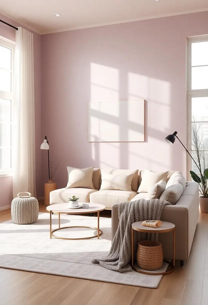
Capturing Tranquility with Soft Lavender and Warm Gray Hues

Imagine enveloping your living room in a soothing blend of soft lavender and warm gray hues,creating a serene sanctuary that reflects tranquility. By integrating these calming colors, you can transform your space into a peaceful retreat. Soft lavender, reminiscent of quiet sunsets, brings a gentle femininity that pairs beautifully with rich, warm gray tones that ground the palette. this combination not only complements a variety of design elements but also enhances the natural light in your room, making it feel airy and inviting.
To fully embrace this color scheme, consider incorporating various textures and accessories to add depth and interest. Here are some ideas to inspire your decor:
- Textiles: Plush throw pillows and light drapes in lavender can invite comfort.
- furniture: Sleek gray sofas or accent chairs provide a neutral base.
- Art and Accessories: Artwork featuring soft lavender scenes can tie the room together.
- Plants: Adding greenery helps to soften the look while boosting the overall harmony.
The magic lies in the balance; layers of these hues can create a cohesive feel that speaks to relaxation and style. Experiment with various shades and textures to ensure your space captures the essence of tranquility in every corner.
Insights and Conclusions
an inviting living room is a canvas where color meets comfort, and timeless neutral tones can serve as the perfect backdrop for a space that reflects individuality and style. By thoughtfully combining these hues with bolder accents or subtle complementary shades, you can transform your living room into a sanctuary that inspires and rejuvenates. Let these color combinations serve as a foundation upon which your unique aesthetic can shine—a harmonious blend of serenity and vibrancy that enhances your day-to-day life. Whether you prefer soft beiges, cool grays, or warm taupes, remember that each choice echoes your personality. So go ahead, experiment, and elevate your space into one that tells your story, inviting warmth and creativity into every corner. Happy decorating!
As an Amazon Associate I earn from qualifying purchases.